
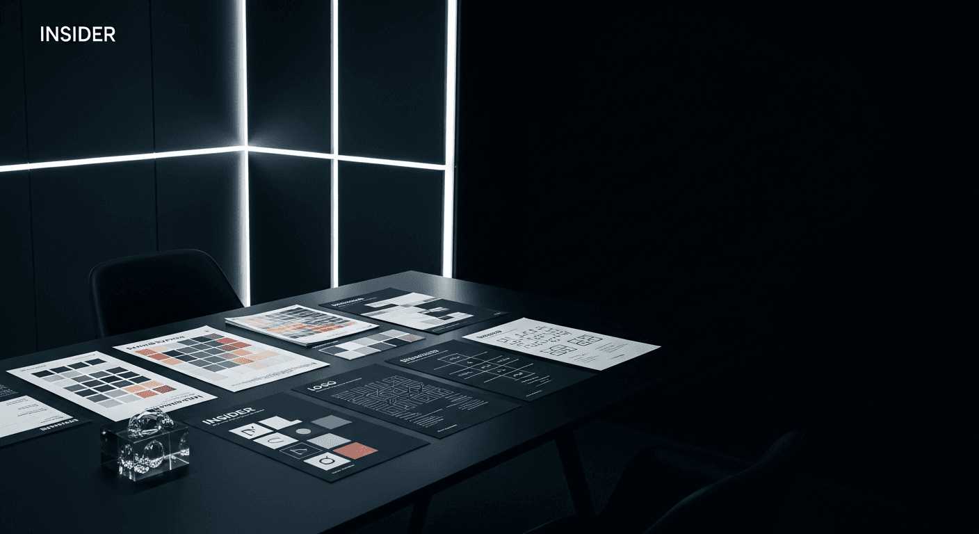
The Color Decisions That Quietly Decide Whether People Trust You
Color is read before anything else is
By the time someone consciously registers a headline, they've already formed an impression based on color — whether the brand feels expensive or accessible, serious or playful, established or new. That judgment forms in a fraction of a second, well before language gets involved. Which means a palette isn't decoration. It's the first argument a brand makes for itself.
Confidence reads as fewer colors, used more deliberately
Brands that feel uncertain of themselves tend to reach for more colors, as if variety might compensate for a lack of clarity. Brands that feel sure of themselves tend to do the opposite — committing to a tight palette and trusting it to carry weight across very different contexts. That restraint isn't a limitation. It's what makes a brand recognizable at a glance, in a feed full of competitors trying to do the same thing louder.
Testing color the way you'd test a headline
We've started treating palette decisions with the same rigor we apply to copy — testing how a color choice performs in context, not just in isolation on a swatch. A blue that feels trustworthy on a slide can feel cold on a checkout page. The right palette isn't the one that looks best in the brand deck. It's the one that does its job in the moments that actually matter.
More from the journal
Insight
Designing Brand Systems That Survive Contact With Reality
Why most brand guidelines gather dust Every agency has shipped a beautiful 80-page brand guideline that was opened twice and never touched again. The problem usually isn't the design work — it's that ...

Case Study
What Clients Mean When They Say "Make It Pop"
The phrase that makes every designer's stomach drop "Can you make it pop?" might be the most-dreaded sentence in client feedback — vague enough to mean almost anything, specific enough to feel like a ...